1. Color Schemes
Most news websites use dark text on a white background. Obviously, these websites contain a huge volume of content, and readability is important. A few of the websites mentioned later in this article use darker colors for headers or for the body of the page outside the content.
A large percentage of news websites also use blue and red in addition to a dark gray or black for text. Blue is extremely common for headlines, article titles and links. Red is often used sparingly as an accent color. Some news websites also mix in more colors in other places, such as in the navigation.
2. Header and Sidebar Banners
Of course, all of these websites need to produce revenue, and banner ads in headers are a key source of income. Some websites use banner ads on all pages, and others exclude banners on the home page but display them above the header on other pages.
While blogs commonly use 125 by 125 pixel banners in sidebars, news websites commonly use 300 by 250 banners or tall skyscrapers. Many of the websites mix in some AdSense or other text link ads.
3. Top Navigation
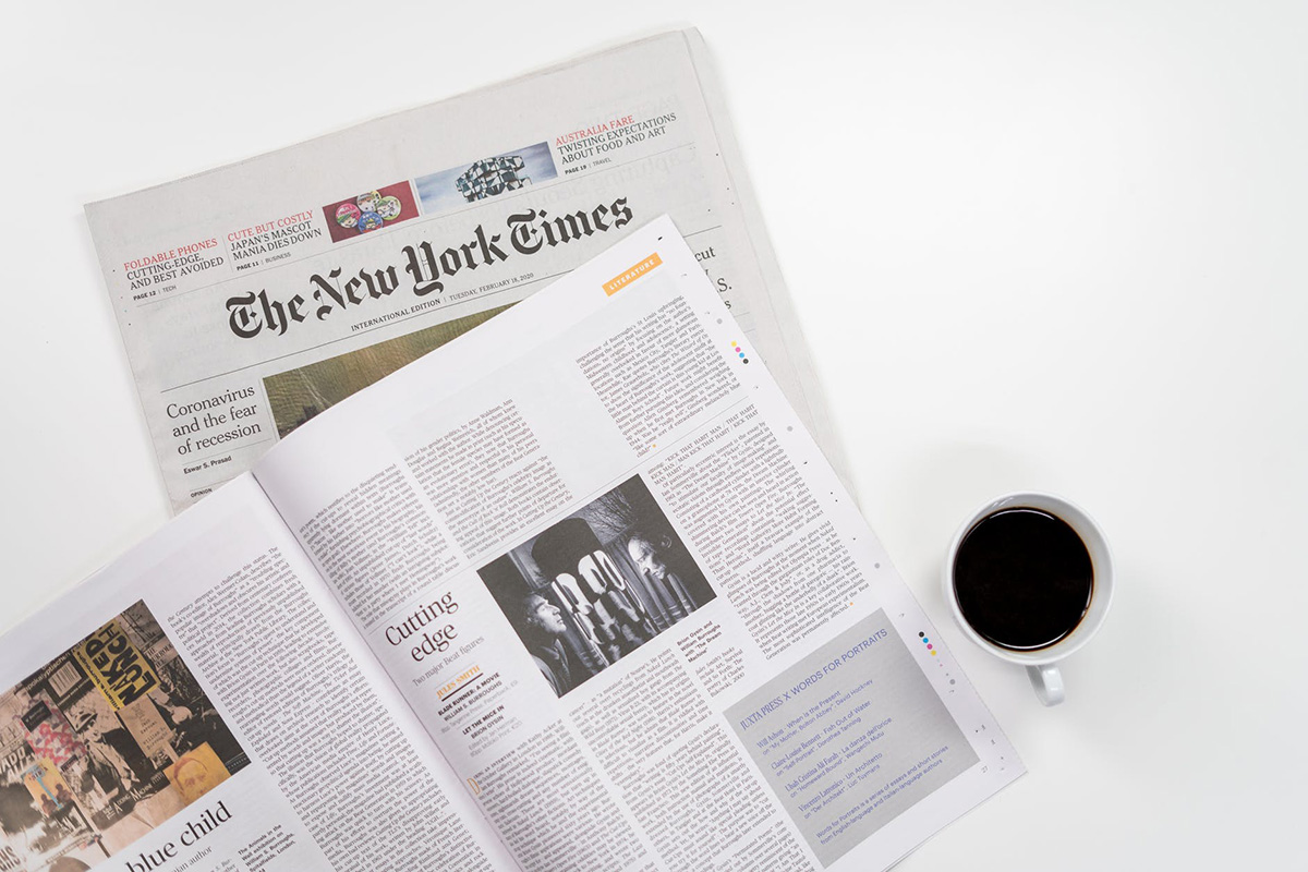
Although there are a few notable exceptions to this trend, most news websites put their primary navigation menu just below the header and above the content. The New York Times and MSNBC are two of the exceptions, as they both use the left sidebar for the main navigation.
4. Tabbed Content Areas
Many news websites use tabbed content areas that allow visitors to see popular articles, recent articles, most commented articles, etc. This is sometimes used in the sidebar, and other times in the main content area, such as on Wired. This allows for more control by users over what content and links they see, and it can save space in the design by making more content accessible in a specific area.
5. Grid-Based Layouts
Newspaper websites are commonly built with grid-based designs. The grid is a popular choice not only because of the sharp look it creates but because it’s one of the most effective ways to manage and organize a large amount of content. The New York Times has one of the more well-known grid-based layouts.


Leave A Comment